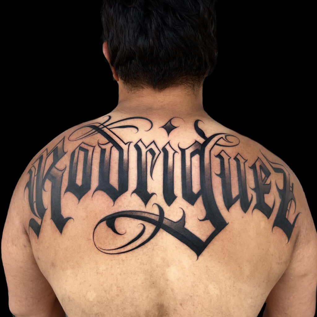
Open letterforms
Interior spaces help letters separate from one another. For example, a larger size or a simplified flourish can protect clarity when the chosen alphabet has dense shapes.
Script • Blackletter • Custom calligraphy
Your words deserve more than a typed font. Explore real FIRME COPIAS lettering tattoos, compare custom styles, and build a design around clear letterforms, body flow, and the meaning you want to carry.
Meaning shaped for skin
Lettering can mark a name, date, promise, memorial, prayer, place, family connection, personal rule, or phrase that only needs to make sense to you. However, meaningful words still need strong design. The letter style, spacing, line weight, size, and placement must work together before the tattoo begins.
At FIRME COPIAS, clients looking for lettering tattoos in San Antonio can bring a typed reference, hand-drawn idea, signature, handwriting sample, photograph, or general direction. Then our team helps match the project with an artist whose portfolio fits the look, from bold blackletter and ornamental script to clean block letters, monograms, and custom calligraphy.

Lettering tattoo portfolio
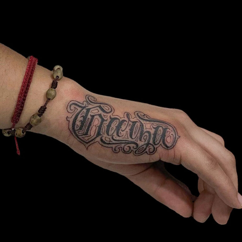
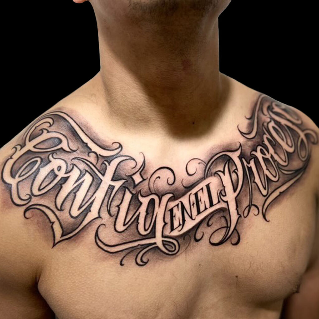
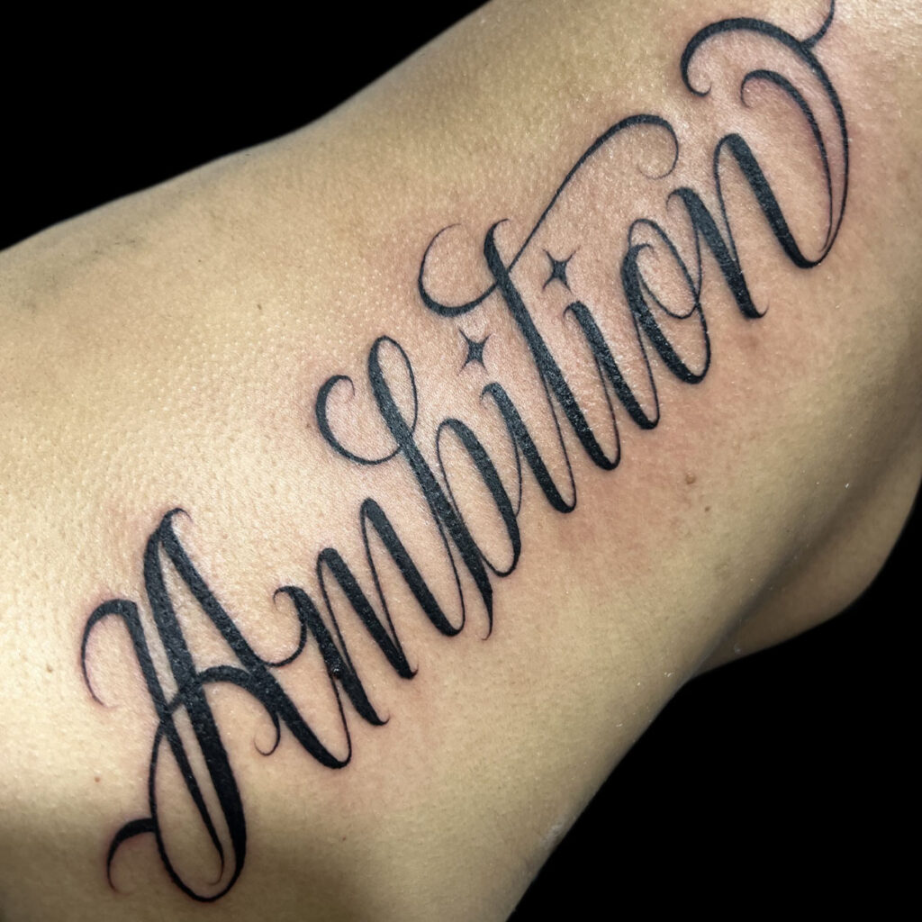
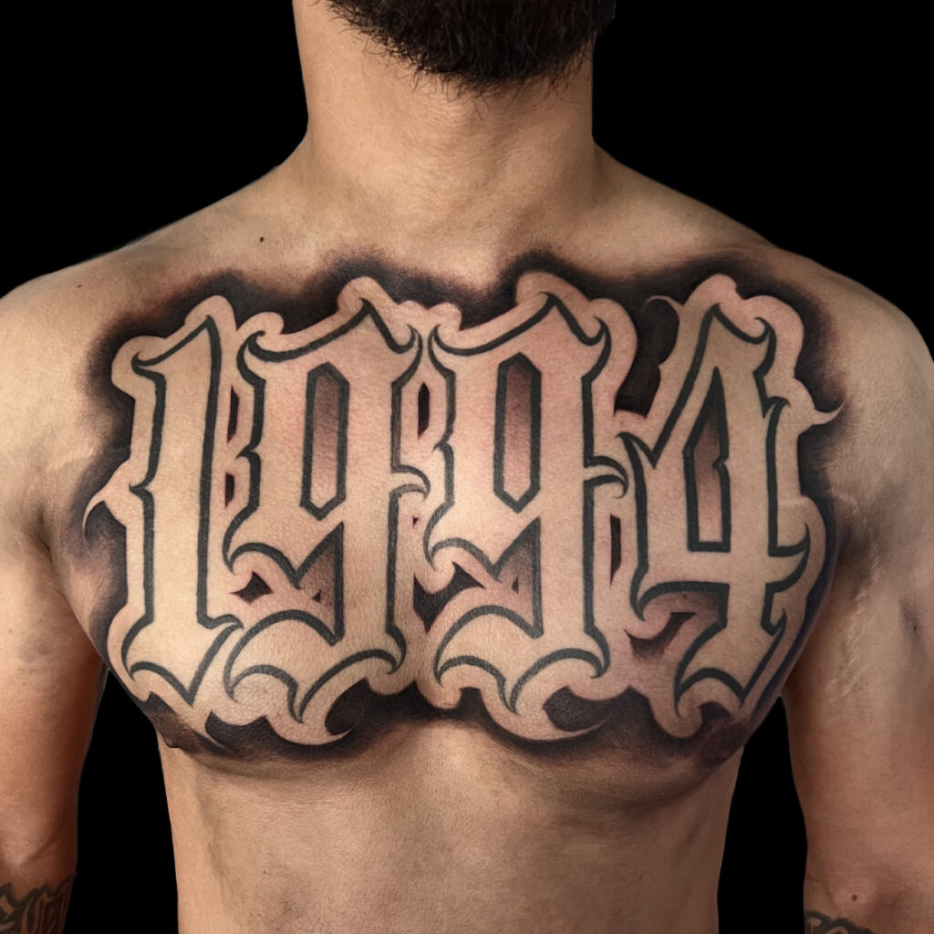
A strong lettering portfolio should prove more than one decorative alphabet. Look for controlled spacing, steady curves, clean interior openings, useful contrast, balanced flourishes, and compositions that fit different body areas. In addition, hand-drawn studies show how an artist develops letterforms before they reach the skin.


Choose a voice for the words
Script can feel personal, flowing, formal, romantic, or sharp depending on the slant, rhythm, connections, and flourishes. Meanwhile, blackletter and Old English-inspired forms use stronger vertical strokes, dense shapes, and a more architectural look. Block letters can feel direct and clean, while monograms and ornamental lettering turn initials or short words into a larger symbol.
Chicano-influenced lettering, calligraphy, fine script, numerals, dates, and custom-drawn alphabets can also move in different directions. Therefore, do not choose by a font name alone. Compare real tattoos from the artist and decide whether the words should feel bold, restrained, elegant, aggressive, devotional, historic, or personal.
Readability is part of the artwork
No artist can guarantee exactly how every tattoo will change because skin, placement, healing, sun, aftercare, design, and lifestyle all matter. Nevertheless, the artist can avoid squeezing long words, tight counters, thin strokes, and heavy flourishes into a space that cannot support them.
Interior spaces help letters separate from one another. For example, a larger size or a simplified flourish can protect clarity when the chosen alphabet has dense shapes.
Spacing does not have to be mechanically equal, but it should feel intentional. Therefore, baselines, joins, stroke widths, and word gaps must work as one composition.
Long phrases and detailed alphabets need more room than short names or dates. If the text becomes crowded, the artist may recommend fewer words, a new placement, or a cleaner style.


Build around the body
Forearms, upper arms, legs, chest, back, ribs, hands, neck, and head can all support lettering, but they do not offer the same shape or movement. For example, a forearm gives a long path for a word or phrase, while the upper back can carry a wider composition with a central arch and larger flourishes.
Hands, necks, fingers, elbows, knees, and other high-movement or high-exposure areas need more specific planning. In addition, an existing tattoo may change the available baseline, contrast, and negative space. Show the artist the exact body area before the final layout is approved.
The artist may curve, stack, rotate, widen, or tighten the overall composition to follow the body. However, those choices should preserve the intended reading order and keep important letters from disappearing around an edge.
Words can stand alone or join a larger piece
Solid black and black-and-gray lettering are common because clear contrast supports the structure. However, color can work through selected fills, outlines, shadows, highlights, banners, or surrounding elements when it supports the message instead of competing with it.
A name, phrase, date, or monogram can carry the full composition through letterform, spacing, contrast, and carefully controlled ornamental movement.
Roses, religious imagery, portraits, banners, memorial symbols, animals, and location references can frame the words. First, decide which element viewers should recognize.
New script can sometimes connect or frame an existing tattoo. Therefore, the artist must evaluate the available space, old linework, value, color, and direction before promising a layout.


References are the beginning
A typed font can help explain the general mood, but it does not automatically create a finished tattoo. Instead, a lettering artist may redraw the forms, adjust connections, open tight spaces, balance capitals, and shape the composition around the body. The result should reflect your reference without copying another client’s tattoo.
For a loved one’s handwriting or signature, bring the clearest original sample available. A high-resolution scan is usually more useful than a dark, angled screenshot. Then identify which imperfections are important to preserve and which small adjustments may help the reference translate to skin.
Names, dates, prayers, memorials, and personal phrases can also be combined with meaningful imagery. In every case, explain what must remain exact and which decorative details can stay flexible.
Approve every character before tattooing
Lettering is unforgiving when the source text is wrong. Therefore, the client must verify the exact wording and meaning before approving the stencil or final drawing. The artist can review the visual layout, but the client remains responsible for the language and source.
Write the phrase exactly as it should appear, including capitalization, punctuation, apostrophes, accents, dates, initials, and Roman or Arabic numerals.
For quotations, sacred text, foreign languages, family names, and memorial dates, confirm the original source or translation with someone qualified before the appointment.
Before tattooing begins, inspect every letter in the final orientation. In addition, confirm the order, line breaks, direction, placement, and any mirrored or upside-down request.
Portfolio before promises
The best artist for your tattoo depends on the exact direction. Therefore, compare portfolios for the alphabet, scale, placement, line weight, ornamental control, and level of custom drawing your project needs.
Review actual lettering across forearms, hands, necks, heads, backs, arms, and legs. Consistency across several pieces matters more than one strong image.
A responsible artist may suggest a larger size, different placement, fewer flourishes, or a simpler letterform when those changes protect clarity.
Start with the FIRME COPIAS shop closest to you. Our team can help direct the project to another San Antonio artist or location when that portfolio is a stronger fit.
Clients should also expect clear preparation and aftercare instructions and practices consistent with applicable studio requirements. Texas regulates tattoo and body-piercing studios through the Texas Department of State Health Services tattoo-studio program.
From exact wording to final placement
First, a clear process helps the artist understand both the meaning and the visual direction before drawing begins.
Share the verified text, capitalization, punctuation, source, placement, approximate size, and useful references.
Compare portfolios for script, blackletter, calligraphy, block letters, ornamental work, and similar placements.
The artist shapes the letterforms and spacing; then you approve every character, line break, and placement before tattooing.
Arrive prepared, follow session guidance, and use the exact aftercare instructions provided by the shop.
Choose the best way to begin
All four FIRME COPIAS San Antonio shops welcome walk-ins daily. However, availability depends on the artist, wording, placement, drawing time, estimated session length, and current shop schedule.
A short name, date, numeral, or straightforward phrase may work the same day when the right artist has enough time.
Long text, handwriting, large blackletter, ornate calligraphy, difficult placements, and compositions with imagery should usually be planned.
Provide exact text and explain what you like about each visual reference. In addition, show the real body area and approximate dimensions.
Quotes based on the actual project
Pricing depends on the artist, size, placement, letter style, custom drawing, detail, session length, and whether the words include backgrounds or other imagery. For example, a short date in clean block letters and a large hand-drawn back piece do not require the same preparation or tattoo time.
Therefore, send the exact wording, body placement, approximate dimensions, preferred style, and references when requesting an estimate. An in-person review may be useful when the placement moves, wraps, includes existing tattoos, or needs to cover an old name or phrase.
FIRME COPIAS also offers a 25% military tattoo discount for qualifying active-duty service members, veterans, retired military, Reserve, and National Guard clients with military identification. Offer terms apply and discounts cannot be combined.
Long-term care
Follow the exact aftercare instructions provided by your artist during healing. Afterward, sun protection can help protect tattooed skin and contrast. For general long-term guidance, review the American Academy of Dermatology’s tattooed-skin care information.
Four San Antonio tattoo shops
First, start at the nearest shop with the exact text and your references. If another FIRME COPIAS artist is a stronger match for the lettering style you want, the team can help direct the project.
Serving Southwest San Antonio, Lackland-area clients, and nearby neighborhoods. Open daily 9 AM–2 AM; walk-ins welcome.
Serving the West Side, Loop 410, Marbach, Lackland-area clients, and surrounding communities. Open daily 9 AM–2 AM.
Serving Culebra Road, Alamo Ranch, Northwest San Antonio, and nearby neighborhoods. Open daily 9 AM–2 AM.
Serving Northwoods, Stone Oak, US 281 North, Bulverde Road, Encino Park, and surrounding areas. Open daily 9 AM–2 AM.
Compare the direction before you book
Some lettering ideas include portraits, flowers, religious art, banners, or old work that needs technical planning. Therefore, these pages can help clarify the complete direction before the artist draws.
Lettering tattoo questions
These answers cover the main choices clients make before walking in, choosing an artist, or booking a custom lettering tattoo consultation.
FIRME COPIAS artists create custom script, blackletter, Old English-inspired lettering, calligraphy, block letters, monograms, numerals, ornamental lettering, names, dates, memorial text, and other reference-led designs. The best direction depends on the words, placement, size, and artist portfolio.
Yes, when the reference is clear enough to work from. Bring the highest-quality original scan or photograph available. The artist may recommend small adjustments to spacing, line weight, or size so the handwriting remains recognizable and works better as a tattoo.
There is no single minimum that fits every design. Thin strokes, tight counters, long phrases, detailed flourishes, and crowded spacing usually need more room. Your artist may recommend a larger size, fewer words, or a simpler letterform to protect clarity.
Start with the mood, exact text, approximate size, and body area. Then compare artist portfolios for script, blackletter, calligraphy, or block lettering. The artist can shape the baseline, spacing, and flourishes around the movement and available space of the placement.
The client must approve the exact final text before tattooing. Bring a verified spelling, capitalization, punctuation, date, numeral, quotation source, and translation. The artist can review the layout, but the client remains responsible for confirming the wording and meaning.
Sometimes. A short phrase, name, date, or simple design may work as a walk-in when an appropriate artist has time. Long text, custom calligraphy, difficult placements, large compositions, and handwriting adaptation should usually begin with a consultation or appointment.
Pricing depends on the artist, size, placement, letter style, amount of custom drawing, detail, session time, and whether the design includes backgrounds or other imagery. Share the exact wording, placement, dimensions, and references for the most useful estimate.
Yes. Solid black and black-and-gray lettering are common because contrast supports clear shapes, but selected colors, outlines, shadows, highlights, or surrounding imagery can also work. The palette should support the words instead of making them harder to read.
Often, but the artist must see the existing tattoo, available space, placement, color, and condition first. A photo can begin the conversation, while an in-person review may be needed to decide whether the new text should connect, frame, overlap, or remain separate.
Follow the exact cleaning, moisturizing, clothing, water, activity, and sun instructions given by your artist. Do not pick or soak the tattoo while it heals. After healing, sensible sun protection can help protect tattooed skin and contrast.
Bring the exact words
Finally, choose the closest FIRME COPIAS San Antonio shop, share the verified wording and placement, and let the team help match the work with the right artist. Walk in with a straightforward idea or book ahead for custom drawing, handwriting, and detailed planning.